However, when I started making the hat, it was almost impossible to tell the MC and CC apart. My brother's girlfriend described the look as "noise" rather than a discernible pattern. This is not really the point of colorwork, now is it?
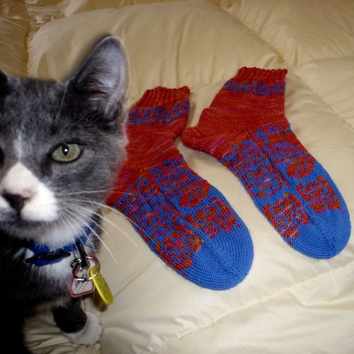
The solution: contrast. I hit on it this summer when I paired a blue and white variegated yarn with another blue yarn for my first attempt at the Mad for Fair Isle Batik Style socks. It looked good from a viewing distance of a few centimeters, but you couldn't even see the pattern any further back. Then, I switched my main color from blue and white to a pink and orange variegated.
Ta da! The contrast makes the pattern visible. Or would, if my picture was bigger. (Trust me, they look great) A quick perusal of my Ravelry page shows me that all of my surviving color patterns (except one) have really bold internal contrast. Of course, don't follow any rule off a cliff. (It would happen that I can't find the example I was looking for. poot) Anyway, I hope that articulating this rule will help me follow it better in the future. Less frogging that way.

No comments:
Post a Comment